Mastering Visual Elements in Complex Topic Explanation

In today’s fast-paced world, the ability to distill complex information into digestible, understandable pieces is more valuable than ever. This is particularly true in the realm of educational content, where the clear communication of complex subjects is crucial. Visual elements such as diagrams, charts, and infographics play a pivotal role in this process. This article delves into the methodologies and benefits of using visual tools to explain intricate concepts.

The Power of Visualization

Humans are predominantly visual learners; the brain processes visual information 60,000 times faster than text. This neurological bias towards visuals makes diagrams, charts, and infographics not just beneficial but essential tools in education. When used effectively, these tools help bypass the verbal part of the brain and speak directly to our visual faculties, speeding up comprehension and recall.

Starting with Diagrams

Diagrams are one of the foundational tools in visual learning. They are especially useful for showing relationships and hierarchies between various components of a topic. For example, a well-crafted flowchart can illustrate a complex process or workflow with clarity, highlighting steps, sequences, and outcomes. Diagrams such as Venn diagrams, which show the overlaps between different sets, can aid in understanding new relationships quickly.

Progressing to Charts

Charts translate numerical data into visual formats, making it easier to spot patterns, trends, and outliers. Pie charts, bar graphs, and line charts are staples in data representation. Each type of chart has its strengths—pie charts are excellent for showing parts of a whole, bar charts compare quantities, and line charts depict changes over time. The key to using charts effectively is to choose the type that best represents the data and the relationships one wants to highlight.

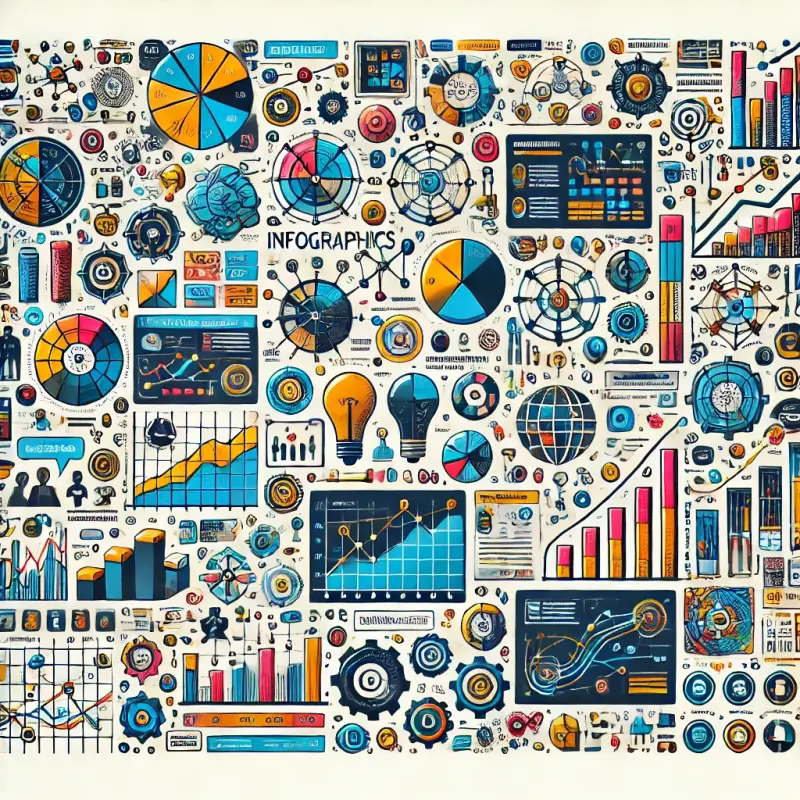
Embracing Infographics

Infographics are where art meets information. They combine graphics, data, and text to inform and persuade visually. Effective infographics are not just about pretty designs; they are strategically crafted to enhance the reader’s understanding and retention of information. They use a mix of visuals and minimal text to explain, narrate, and persuade, often transforming a dense topic into an engaging narrative.

Infographics can be particularly powerful in simplifying technical or dense information. They can break down a subject into manageable pieces, layer information logically, and use visual emphasis to highlight key points. The use of icons, bold colors, and varied typography can direct the viewer’s attention effectively, making the learning process intuitive and less daunting.

Designing Visual Elements Effectively

Creating impactful visual elements requires careful planning and an understanding of both the content and the audience. Below are some best practices for designing diagrams, charts, and infographics that resonate with viewers.

  1. Understand Your Audience’s Needs
    Before you begin designing, consider your audience. Are they experts familiar with technical terms, or beginners who need simple explanations? Tailoring your visuals to the audience ensures they find the content accessible and engaging.

  2. Focus on Clarity Over Decoration
    While it’s tempting to add ornate designs or vibrant colors, these should never come at the expense of clarity. Visual elements must prioritize the content’s meaning. For example, excessive colors or complex patterns can distract from the core message.

  3. Use a Consistent Design Language
    Consistency is key in visual communication. Maintain uniformity in fonts, color schemes, and icon styles across your visuals to create a cohesive narrative. This consistency helps viewers focus on the content rather than being distracted by mismatched design elements.

  4. Incorporate Visual Hierarchy
    Visual hierarchy involves guiding the viewer’s eye to the most critical parts of the visual first. Use size, color contrast, and placement strategically to emphasize key points. For instance, in an infographic about climate change, larger icons or bold colors might highlight major contributors to greenhouse gases.

  5. Simplify Complex Concepts
    When explaining dense topics, it’s essential to distill the information into its most straightforward form. Avoid overcrowding visuals with excessive data or text. Instead, focus on presenting one concept per diagram or chart to avoid overwhelming the audience.

Tools and Techniques for Creating Visuals

Thanks to technology, you don’t need to be a professional designer to create compelling visuals. Several tools and techniques can help you bring your ideas to life:

  1. Diagramming Tools
    Platforms like Lucidchart and Miro make it easy to create flowcharts, mind maps, and other diagrams. These tools often provide templates that can be customized for various purposes, saving time while ensuring professional results.

  2. Chart Creation Software
    Excel and Google Sheets remain staples for generating charts. However, for more visually appealing designs, tools like Canva and Flourish offer templates that combine aesthetics with functionality.

  3. Infographic Design Platforms
    For infographics, platforms like Piktochart and Venngage offer intuitive interfaces and templates that make crafting engaging visuals straightforward. They allow users to combine icons, graphs, and text seamlessly, ensuring a polished final product.

  4. Design Techniques

    • Whitespace Usage: Avoid clutter by incorporating whitespace to give the design room to breathe.
    • Color Theory: Choose colors that complement each other and enhance readability. Use color sparingly to highlight important information.
    • Icons and Illustrations: Use icons to represent ideas visually. These can act as universal symbols, making concepts easier to understand.

Integrating Visual Elements into Educational Content

The ultimate goal of visual elements is to enhance learning. To achieve this, they must be integrated thoughtfully into educational materials. Here are a few strategies for seamless integration:

  1. Pair Visuals with Text
    While visuals are powerful, they work best when paired with concise, well-written text. Text can provide context or additional details that visuals alone might not convey.

  2. Sequence Information
    Layer information logically to guide learners step by step. For instance, start with a diagram that provides an overview, then use charts or infographics to dive deeper into specific details.

  3. Encourage Interaction
    Interactive elements like clickable charts or animated infographics can boost engagement. Tools such as PowerPoint and online platforms like Prezi allow creators to design interactive visual content.

  4. Test for Effectiveness
    Once your visuals are ready, test them with a sample audience. Gather feedback to identify areas where clarity or design can be improved.

Case Study: Simplifying Scientific Concepts

Consider a scenario where you need to explain a scientific process like photosynthesis. A traditional approach might involve dense paragraphs of text. Instead, using visuals, you could create:

  • A diagram showing the relationship between sunlight, water, and carbon dioxide.
  • A flowchart outlining the steps in the process.
  • An infographic combining visuals and short text to summarize the entire concept.

Such an approach not only simplifies the topic but also engages the audience, making learning more effective.

Artykuły

Dołącz do listy powiadomień, aby zawsze mieć dostęp do najnowszych i najbardziej interesujących artykułów w swojej skrzynce!